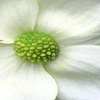

I have been practicing printing on slightly colored paper to make invitations. Colors like light ivory, straw, violet or blue are very common. The problem is that the color of the substrate will have an important influence on your image, even with very light colors. After wasting a lot of ink and paper to obtain so so results... I decided to try a kind of homemade 'soft proof' to see on screen which kind of edits would be beneficial to my prints.
To begin with, I have to know the paper color: a scan will give me a way to check this colour with the eyedropper.
Now, I presume that lighter tones of my images cannot cover and hide the substrate, while middle to dark tones are pretty much unaffected. To mimic the effect, I add a solid color fill adjustment layer with the calculated color values. I'll have to use this adjustment layer mask to hide progressively the effect from light to dark tones. To create this mask, I activate the image layer, select all and copy, then activate the solid color layer, show the mask (Alt Click in the mask icon) and copy inside the mask. This mask is not perfect, assuming middle to dark tones are already covered by my printer's ink, I do a levels enhancement on the mask to pull the midtones to black (upper slider 128 - 255 instead of 0 - 255). Of course, the result is an approximation of the resulting colors and tones on your print.
Now, to correct the image to compensate the color cast, you may add adjustments layers to the image, under the solid color 'filter'. You might try enhancing hue/sat selectively by colors. Adding the same mask is recommended not to change midtones and shadows which are not affected by the 'filter'.
Bottom line: if you can choose a white paper, that's the best solution; you can always tint and add texture for the parts not covered by the picture!